Let’s talk about website previews. The little preview images and descriptions you see when viewing or sharing links on social media networks, blogging platforms, and chat applications. They provide viewers valuable information about the contents of a shared web-page, and help them decide if they should interact with them. Sadly, most website owners and marketing teams don’t realize website previews are customizable and carry huge impact on performance and driving traffic to your website.
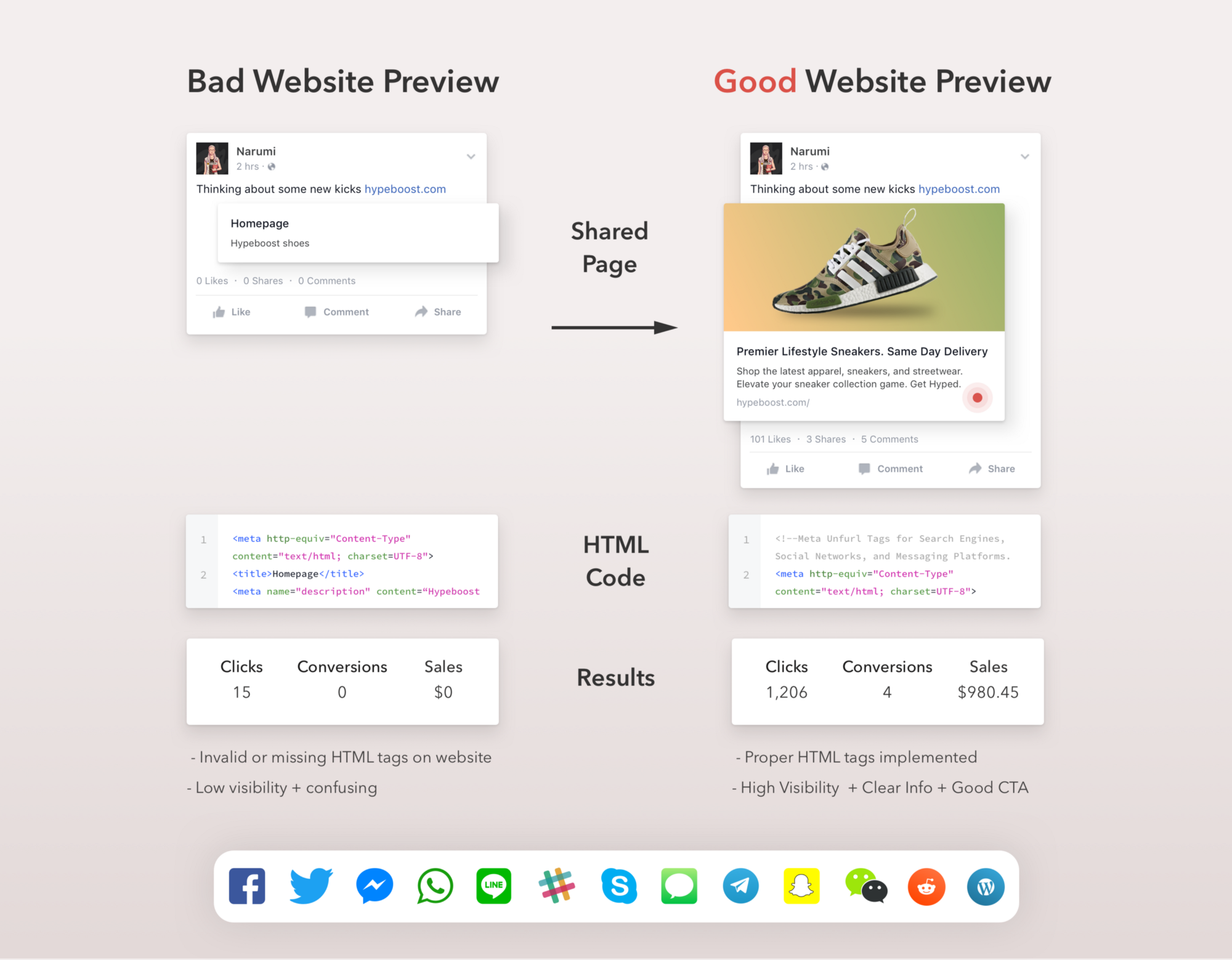
In this medium post, we’ll discuss the current landscape, problems, and opportunities with shared website links and doing business on social networks and messaging platforms.
SPOILER ALERT — website meta tags are super hard, time consuming, and unsexy… But not anymore!! I’m announcing a new set of tools and looking for others to join me in the crusade to build the future of website previews across the internet.
In this mammoth blog post:
- History of the web link. Why do links exist?
- Bad Website Previews. Ouch.
- Performance + Expected Results + Stats
- Current Workflows, Problems, and Pitfalls
- The 2018 Website Marketing Checklist
- Existing Tools. Why + How I Got Here
- New Product Announcement — Lookout by Unfurls.co
- Our Mission & The future of Website Previews
- Unanswered Questions
- Call For Help
1. History of web links and website previews.
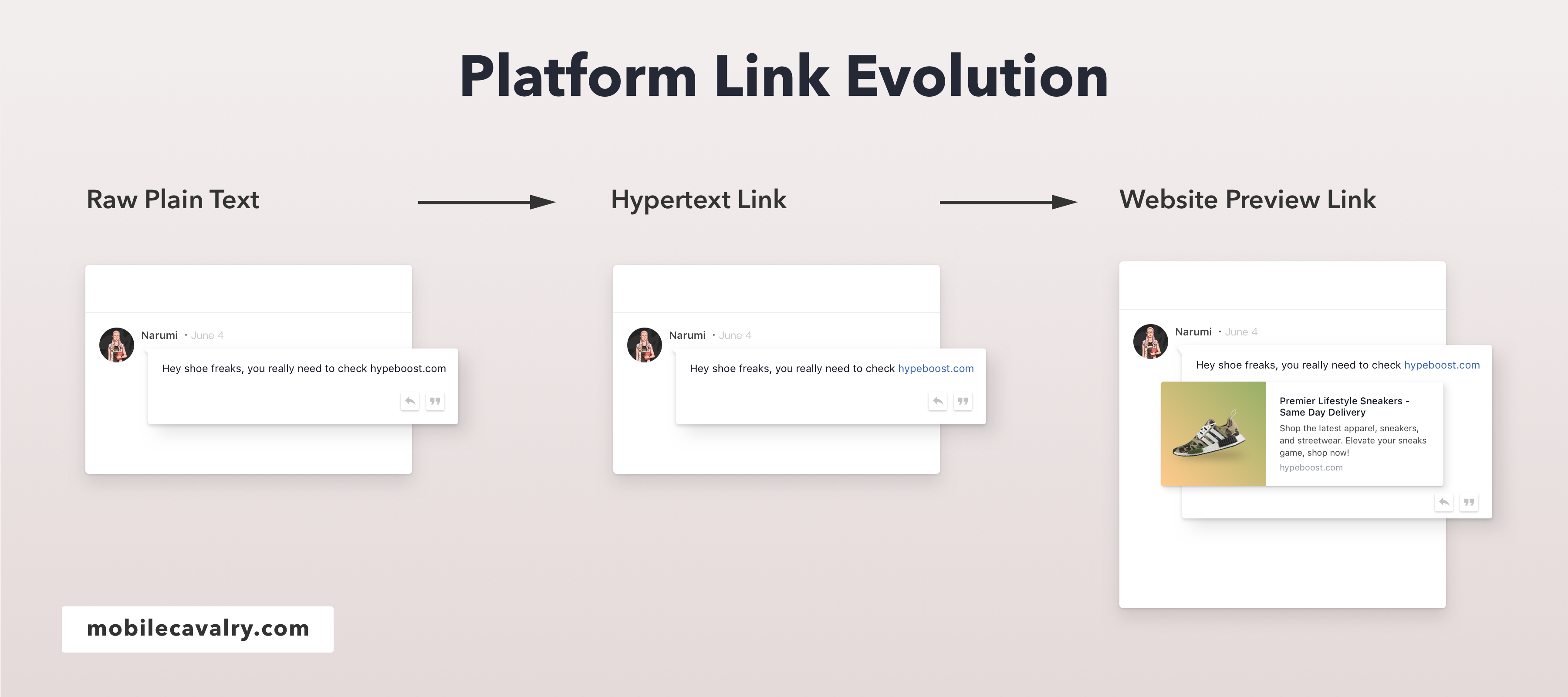
What are web links? Why do they exist? They provide users an easy way to access another location, document, or file on the internet. Typically activated by clicking on a highlighted word, or image on a webpage. Here’s the evolution of the shared link on the world wide web:
Static page, no web links, just raw text. Users navigate each file, folder, or server manually. Switching between pages or documents is time consuming, confusing, and difficult.
Hypertext link. Linking pages or documents with hyperlinks. Users no longer need to manually navigate between pages, they can quickly navigate between pages by clicking the full page document hyperlink instead.
Hypertext link with customizable anchor text. The ability for page owner, or poster to customize the text displayed for a hypertext link. Instead of using the full destination page of http://yahoo.com/news/usa/state20/document-tree/12323200238097232/views/12454177770.html, users can use a short descriptive summary of the target location. It provides users additional context to the details of the destination document or webpage.
Previews from search metadata. Some platforms abandon anchor text links, and develop a new website link experience leveraging search engine metadata. These previews are built using the SEO websites page title, page description, and page url.
Controlled + customized website previews. Platforms create their own standard, and abandon search engine powered website previews. Search tags were problematic because page names and descriptions contain terms and phrases used to rank well within search engines (keyword stuffing), but appear unnatural and spammy in news feeds. Facebook develops a new website preview standard called Facebook Open Graph Tags, allowing website owners a method to specific an image, title, and description for each webpage they own and operate. Other platforms develop their own standard markup for website previews (Twitter Cards, oEmbed, etc).
Why do platforms care about website previews?
Publishers and platforms continually look to improve user experience, reduce spam/malware/fake news, and to encourage businesses to invest more time, resources, and advertising spends on their network.
2. Bad Website Previews. Ouch.. They hurt.
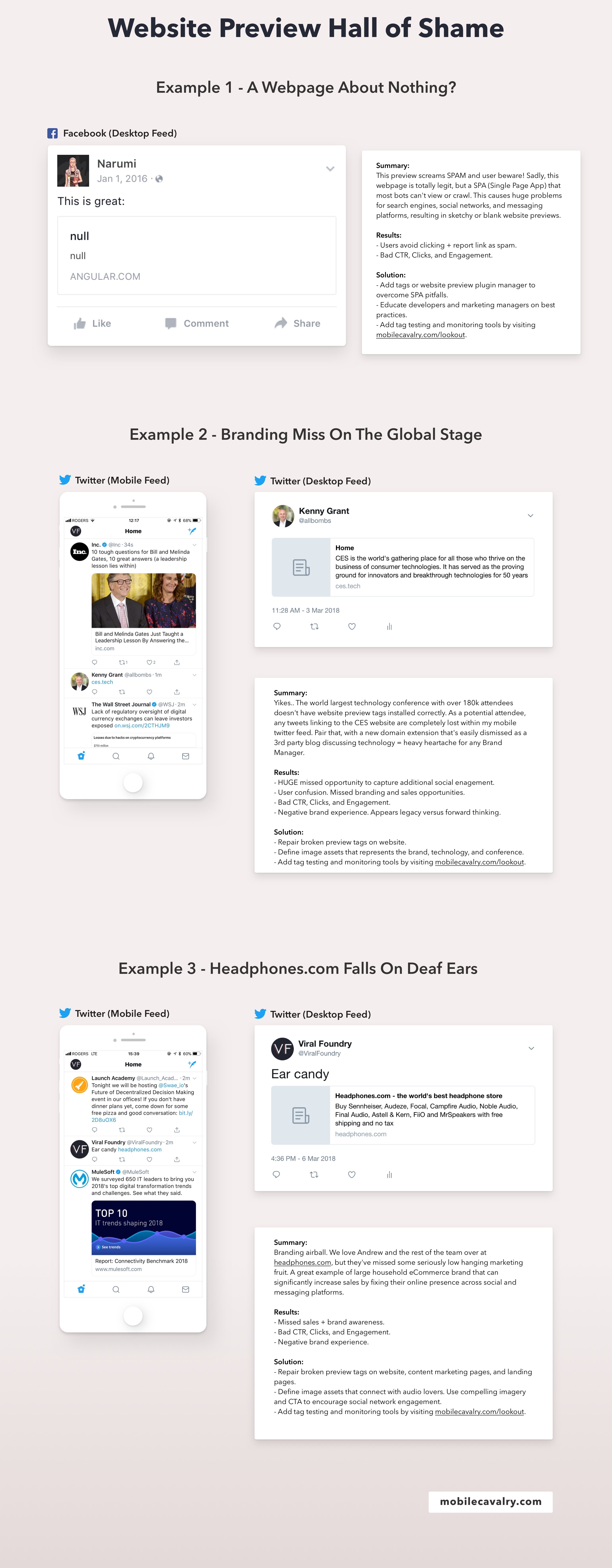
Every-time you share a website, platforms crawl the shared page looking for website preview tags. If no tags are found, platforms try to assemble previews using search engine tags, or by scraping images and text on the destination page. Sometimes it works, other times it’s disastrous. Here’s a few examples of bad website previews from the wild:
3. Performance + Expected Results + Stats
What sort of performance increase should I expect by installing website preview tags properly?
Exact results vary based on vertical and nature of business. We recently encountered a content marketing campaign that improved clicks, shares, and conversions by 300% after implementing tags properly. This low hanging marketing fruit significantly improves traffic, clicks, shares, and the appearance of your brand. Everyone should take notice and implement.
Stats. What percentage of websites use Website Preview Tags properly?
Not many… Shocking stats incoming. According to a recent report by Simartech, most of the internet has failed to install and implement these tags correctly.
Over 50% of the top 10k websites do not strong have FB Open Graph + Twitter Card website preview tags installed properly.
Over 57% of the top 100k websites do not have FB Open Graph + Twitter Card website preview tags installed properly.
Over 63% of the top 1m websites do not have FB Open Graph + Twitter Card website preview tags installed properly
Over 78% of all active websites are missing these tags, or have them installed incorrectly.
4. Current workflows, Problems, and Pitfalls
Why aren’t website owners and marketing teams installing tags properly?
Education — no central hub to learn how to install tags, the individual best practices for each network, and the technical requirements for each of the ever-changing platforms. Teams are unaware of the technical possibilities and how previews impact their business.
Implementation — creating or updating tags requires collaboration from different departments and stakeholders. Implementation or edits require project managers to coordinate with design, marketing, development, and quality assurance. Too many people are required to make changes.
Tools — no workflow tools exist to manage the entire website preview tag process. Existing tools address specific parts of the process, simply don’t work, or are outdated. No central platform or education resource that ties everything together, and simplifies the entire process for teams.
Time — marketing teams are busy. Without education, implementation and workflow tools, the process is just too difficult, expensive, and time consuming.
Current process. A closer look at how teams struggle implementing Website Preview Tags
(SKIP if you want to bypass to the tools section)
Over the last decade I’ve experienced the depths of website preview hell within several different organizations. Big or small, they face similar problems and bottlenecks. For today’s purpose, let’s walk through the process of shipping a new website project from start to finish. We’ll use a 25 person digital agency for our website journey.
Digital Agency starts working on new website project for Acme Company Inc.. With design and development complete, marketing steps up to implement website preview tags. Here’s the typical process in a marketing savvy organization from start to finish:
1. Create Spreadsheet for Website.
Marketing Manager creates excel spreadsheet. Lists out the details of new website. Page name, title, internal description, screenshots, link to brief/overview of each page.
2. SEO Tag Creation.
Marketing Manager sends spreadsheet to SEO (Search Engine Optimization) teammate. They review spreadsheet, conduct keyword research, and add search meta tag information (search engine title, description, updated url slug name, etc). With Search Engine Tags complete, they send back to the marketing manager for next steps.
3. SEO Tag Review.
Marketing Manager reviews newly created page name, title, description, new page slug, ensures it meets the goals of each page. If new page names or copy fail to meet page goals, they are bounced back to the SEO Manager for further revisions.
60% of marketing teams do not continue to next step of creating website preview tags after reviewing SEO tags.
Once Search tags are complete, most marketing managers pass the spreadsheet to the dev team for implementation and website launch.
Before passing to the development team, they should continue to the next step of creating the social and messaging platform tags.
4. Website Preview Tag Creation.
Marketing manager opens spreadsheet, creates new columns for previews (facebook, twitter, and oEmbed information). This process is very manual and time consuming. Most marketing managers are non technical. They might specify a title, description for each webpage, and for each tag (fb, twitter, oembed) and hope someone on the dev team can rewrite everything in proper html at a later stage in the process. Technical marketing managers write raw html within the spreadsheet.
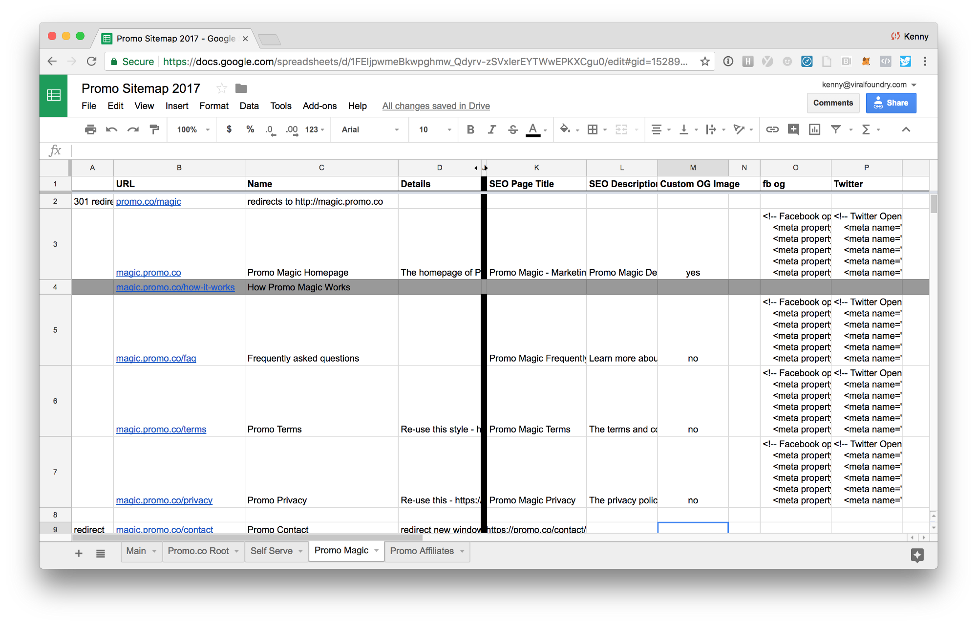
Building previews within excel is problematic. Marketing Managers write these tags without properly testing how they appear for each webpage and network. Spelling typos and invalid HTML are frequent, causing some webpages to crash or load improperly.
5. Designer Create Website Preview Images For Each Page
With website preview tags added to the excel spreadsheet, the marketing manager contacts design team to build preview images for each page. Each webpage* should have a unique website preview image that matches the page, page goal, page title, description, and follow the specs for each platform (Facebook Opengraph, Twitter Cards).
Designer reads creative brief, each page, title, and description for the website preview and creates unique images for each page. They upload to basecamp or save all images within a dropbox or google drive folder, and send back to the marketing manager for review.
Any page that consumers potentially share on social or messaging platforms.
6. Image Review + Revisions
Marketing manager cross references excel with newly created images. Files are often labeled in confusing ways that are time consuming and problematic. Any images revision requests are sent back to designer.
7. Upload Image Assets
After image revisions, the Marketing Manager sends excel sheet and image folder to the development team for implementation. Dev team reviews the spreadsheet, and backend developer uploads all images to a public server.
8. Webpage Implementation
Front End Developer opens each webpage in an HTML editor, cross references each webpage with excel spreadsheet, copies and pastes search engine tags and the website preview tags into header of each webpage
This step is the most critical step in the entire process, but extremely time consuming. Some pages are accidentally missed, tags are added to the wrong page, duplicated across the entire site, contain spelling typos, bad image url paths, or invalid HTML tags that in some cases actually crash the webpage, or entire site.
Once complete, the developer pushes to a QA staging area, or the website LIVE.
90% of marketing teams stop here, and fail to continue to the next step of testing and QA.
9. Quality Assurance + Revisions
Marketing Manager cross references excel spreadsheet while manually sharing each webpage on 10+ social networks and messaging platforms looking for errors. Each webpage takes 1–3 minutes to test, sometimes longer. For many, this is the first time the Marketing Manager has actually previewed the image, title, and description together in one view. Resulting in problems with either the image, page title length or description length. Any changes are sent back to the designer and developer for implementation.
10. Marketing Sign-off
After several revisions, Marketing Manager signs off on website previews and shares news with stakeholders and/or client.
11. Website Live. Stakeholders + Client Left Guessing
Stakeholders, clients, and teammates have no way to verify tags are implemented properly.
Additional thoughts:
Small websites projects are more manageable, but still extremely time consuming, painful, and fail to use website preview tags best practices.
Large websites with 10’s of thousands of pages do not create website previews manually. Many have no website previews whatsoever. The ones that do, use one generic template for their entire website. This is a rookie mistake. Companies spend millions of dollars on optimization, but fail to test, optimize, or monitor the performance of pages. Why? Lack of education, tools, and time.
5. The 2018 Marketing Website Checklist
The new updated checklist for Marketing Managers launching new websites, landing pages, and content marketing campaigns:
- Marketing Brief
- Copy
- Design
- SEO Tags
- Search + Messaging Platform Preview Tags
- Development
- Cross browser testing
- Cross device testing
- Cross search, social, messaging testing
- Website Preview Monitoring
Website Preview Builder, Testing, and Monitoring offered at unfurls.co
6. Existing Tools + Why/How I Got Here?
Before today, there wasn’t a dedicated resource for website previews. A few outdated blog posts and two specific platform debugging tools: Facebook Debugger and Twitter Validator.
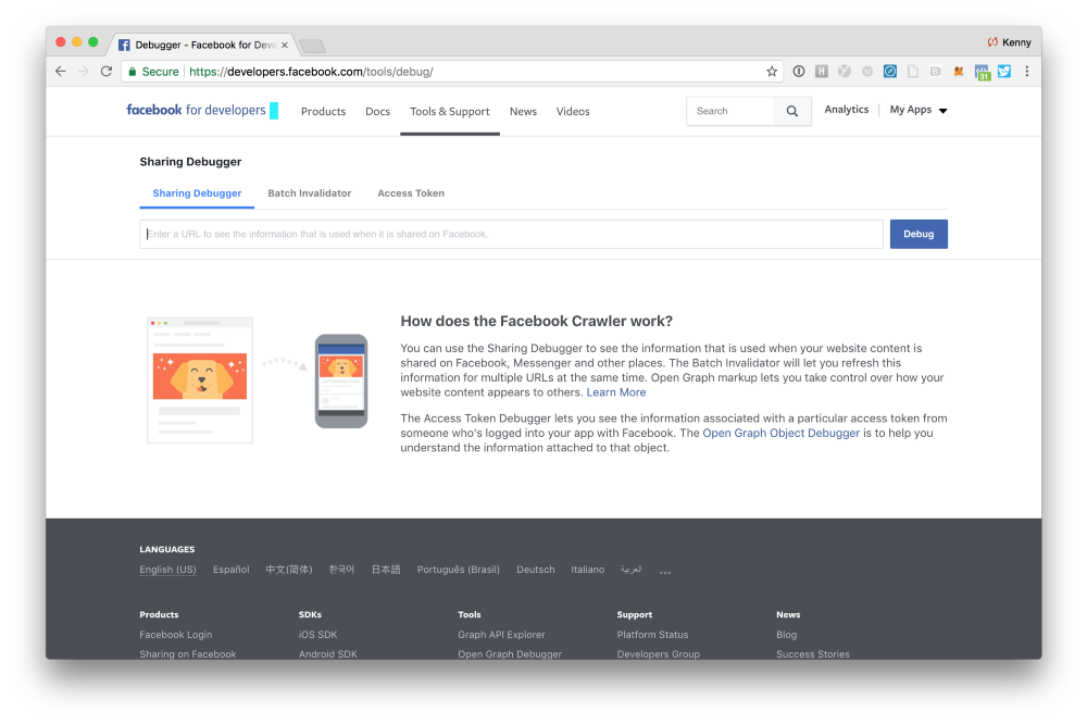
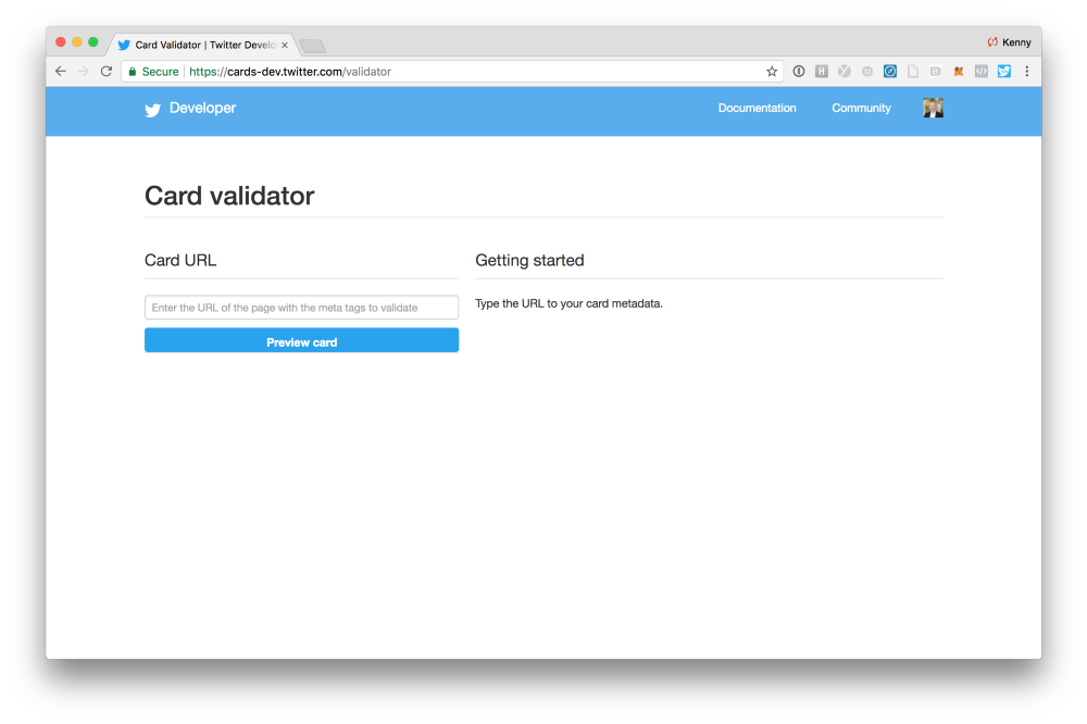
Platforms build tools for their platform. They don’t build for the rest of the web. They focus on the end user and aren’t too concerned with how marketing teams launch and manage websites across the internet. I don’t blame them. How could they? It’s a conflict of interest and extends far past the platform they control.
There needs to be a 3rd party resource that plays nice with website owners, website teams, all platforms, and most importantly the consumers each platform serves. We need workflow tools for websites of all shapes and sizes, with a central place for education and best practices.
I didn’t set sail 18 months ago on a mission to fix crummy website previews. I considered them an essential part of launching new marketing campaigns or owning a website, but I never imagined spending sooo much time and effort thinking about how people visit, share, and engages with websites across the internet. Here’s the story of how I got here, and details on what i’m building.
June 2016 — Enough is Enough
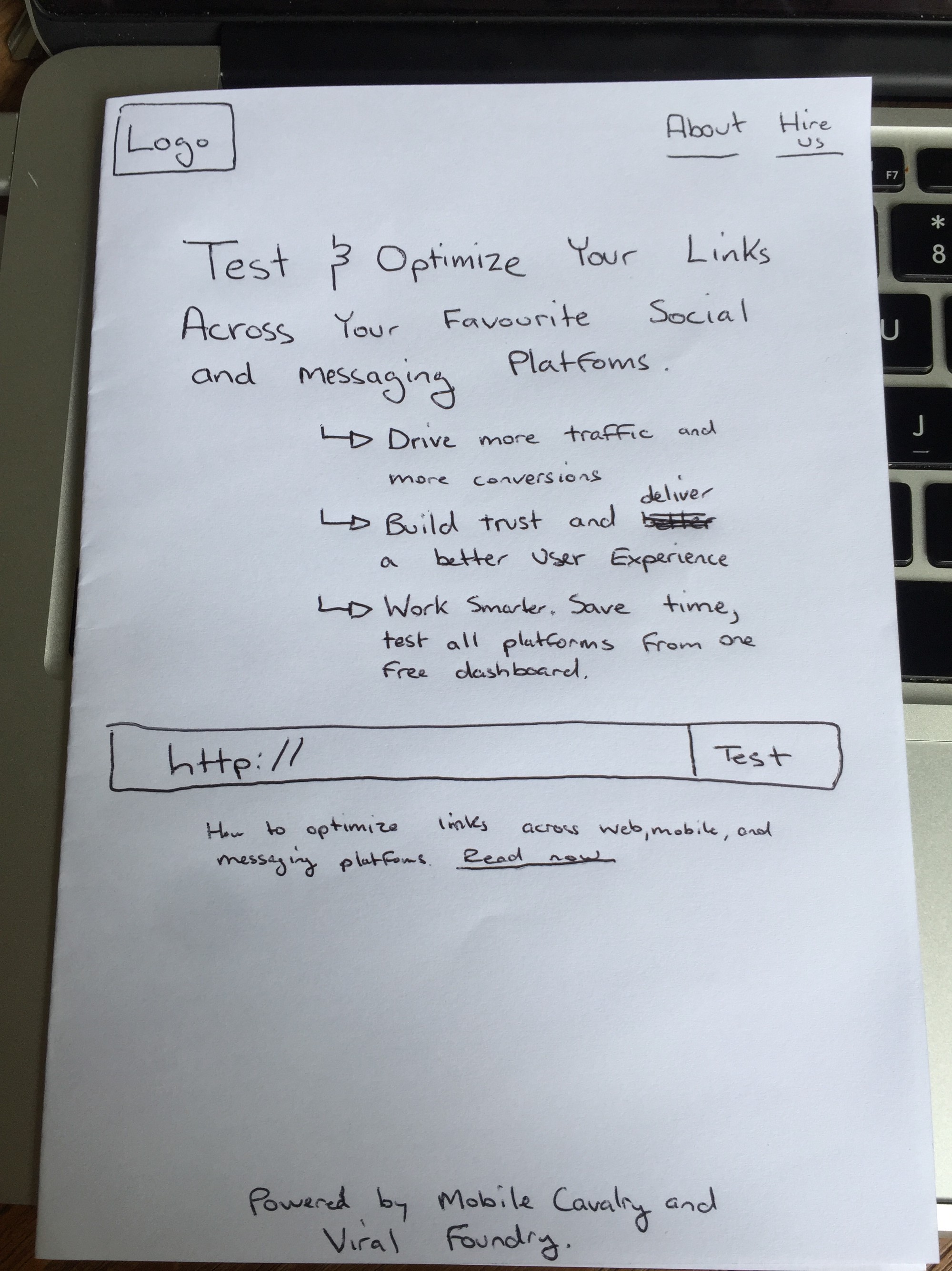
I was in the final stages of creating and testing website preview tags for a new website launch. In the struggle-club, switching back and forth between excel, sublime html editor, github desktop client, facebook debugger, twitter validator, and sharing links on my personal network. “You’ve been hacked” they said. My social network wasn’t too pleased with the 40+ new “website shares” within their feed. I palmed my left hand against my forehead and proclaimed, “This is insanity! Why can’t I preview and test everything within one dashboard without spamming the world?”
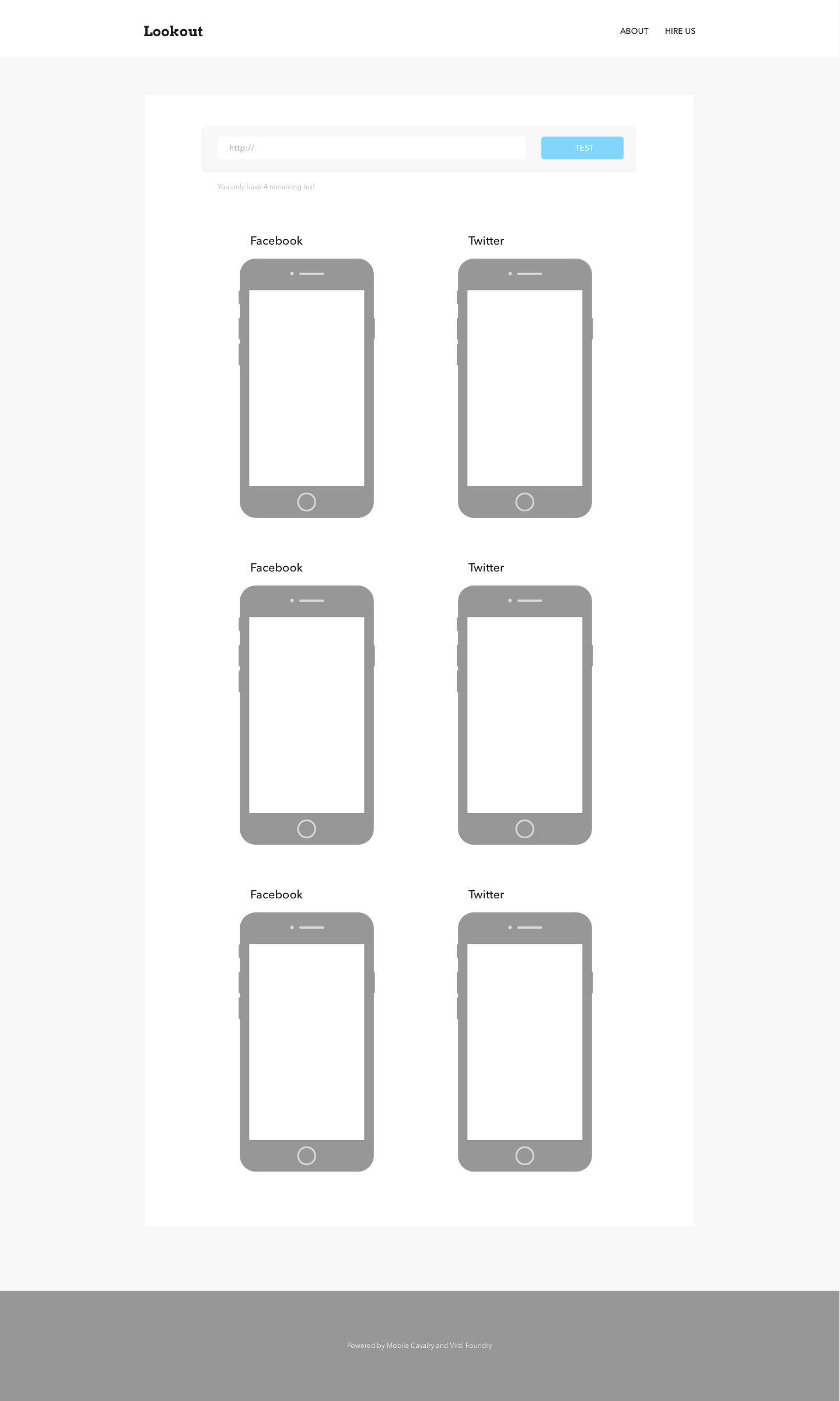
And so it started. I sketched the first version. Marketers could preview a webpage across facebook, twitter, and a few other networks from one screen. Saving time and your news feed. A no brainer tool.
Messaging Platforms In Emerging Markets
Hailing from Vancouver, most of my friends and work peers use FB and Groupme. I wasn’t thinking too much about group messaging platforms or chat applications.
In August of 2015, I traveled to Europe and started spending significant time in SouthEast Asia. During that time, I discovered 2 new messaging platforms called Line and WeChat. Consumers were using these and other messaging platforms in new and exciting ways. Conducting real business. All within chat applications.

In 2011, I was a Product Owner developing new digital products for 60k small businesses across the United States. I researched, played, and launched new digital eCommerce solutions for SMB’s, but I was totally floored with what was going on in SE Asia. They had definitely leapfrogged North America in terms of chat messaging and small business commerce. Lots to learn, and chat applications were now on my radar and something I wanted to include in the tool.
Name and Brand?
My little tool had a name — Lookout. A simple way to preview your link across the internet and make changes from one browser tab. The preview tool grew from 3 networks to 5, then to 7 to include chat applications, and then to 12 different platforms. New applications that were important to businesses in other geography regions outside of North America.
I thought Lookout was useful, but not something that could standalone. I had been traveling for over 2 years now. Visited over 30 countries, and living out of a suitcase. I was far removed from life in North America and meeting interesting people every week via tech startup conferences and local meetups. I was fascinated with locals. Watching how they use and leverage technology in a mobile only world.


I wanted to create a resource for technical marketing managers. People like myself. Covering news, interviews, and case studies across digital marketing. A resource to stay abreast of everything that’s happening locally, abroad, and within emerging markets. My existing marketing subscriptions provided an abundance of marketing bs and fluff. “If I create a monthly resource, will people actually read it?” Regardless, it would be an excuse to stay on top of digital marketing. I wanted to call the monthly marketing magazine Intel, short for Intelligence.
I had an existing domain of MobileCavalry.com and decided to wrap Lookout and Intel under one brand. The vision; create small, but powerful digital tools for technical marketing teams on a subscription basis. Provide valuable, non bullshit marketing intelligence to teams struggling to stay on top of today, and fighting for tomorrow. Every month we’d deliver the latest digital marketing tips (with a global perspective), case studies, and at least one golden nugget of learning that you and your team could apply to your team and business.
We would develop small tools as we identified pain points, and offer them as part of the monthly subscription.
Standing Out
Instead of stiff and traditional, I wanted the brand to stand out. Something completely different. “How can we build a community, connect with people, tell our story with global perspective, be totally different, and have a bit of fun?” We developed 5 characters. Everyone you would expect in a small digital team — a marketer, developer, designer, researcher, and leader. They were inspired by teammates, people I met on my travels, and some memorable times in Japan. “Could we create a small community and level up marketing teams? How can do this without distracting them?”

Feedback Round 1
With the first version of Lookout, Intel, and the Mobile Cavalry website complete, we setup 3 LIVE feedback sessions with marketing professionals in my existing network via Skype. Some feedback from those sessions:
“For Lookout, why do I care? What makes a good website share, versus a bad website share? How can I make my website better?” — feedback 1
“It would be good to know if my link is good, or bad. How can I share this with my developer? How do we fix it?” — feedback 2
“I didn’t know these were adjustable” — feedback 3
From those sessions, we created a scoring system, shareable reports, and personalized tips for each Lookout result. We also created a website preview builder; a simple interface to build website previews for search engines, facebook, and twitter. Marketing Managers could now create perfect tags, and export the HTML in minutes.
Feedback Round 2 — TIA Jakarta 2017
In November of 2017, we brought Mobile Cavalry to Tech In Asia Jakarta. Visitors to our booth were confused with our offering, but after walking them through a demonstration, they quickly understood the value of Lookout. Many teams showcasing at the conference focused on eCommerce, delivery, and fulfillment. Problems that were solved 5–10 years ago in Europe and North America. This wasn’t the best audience for our product, but provided some new ideas around eCommerce within messaging platforms in SE Asia.




Mobile Cavalry & Lookout feedback from the conference:
“How do I create my first website preview? What are the best practices for my type of business” — Delivery based startup business owner
“Woah. I had no idea. My entire ecommerce website looked awful across messaging platforms. Every page needs help.” — ecommerce owner
“The characters are confusing. I missed the value of Lookout because of the characters” — investor
With feedback and new ideas, I returned to Vancouver and continued to build out some new features with the rest of my team. We set February as our official launch date.
7. New Product Announcement — Lookout by Mobile Cavalry
On on February 14th , we pushed everything LIVE to Product Hunt and to our existing network of website owners and digital agencies.
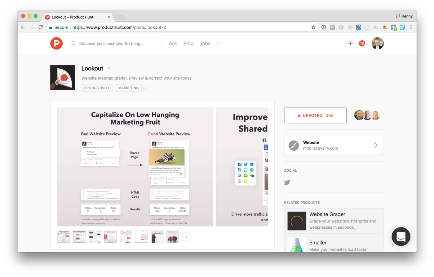
Today, we’re attacking 3 areas teams face with website previews: education, workflow tools, and monitoring. These stem from problems we’ve personally faced as website owners, inside marketing teams, and as a platform.
Website Previews aren’t very sexy, but an important part of the internet. We hope some of these tools can help you:
Lookout
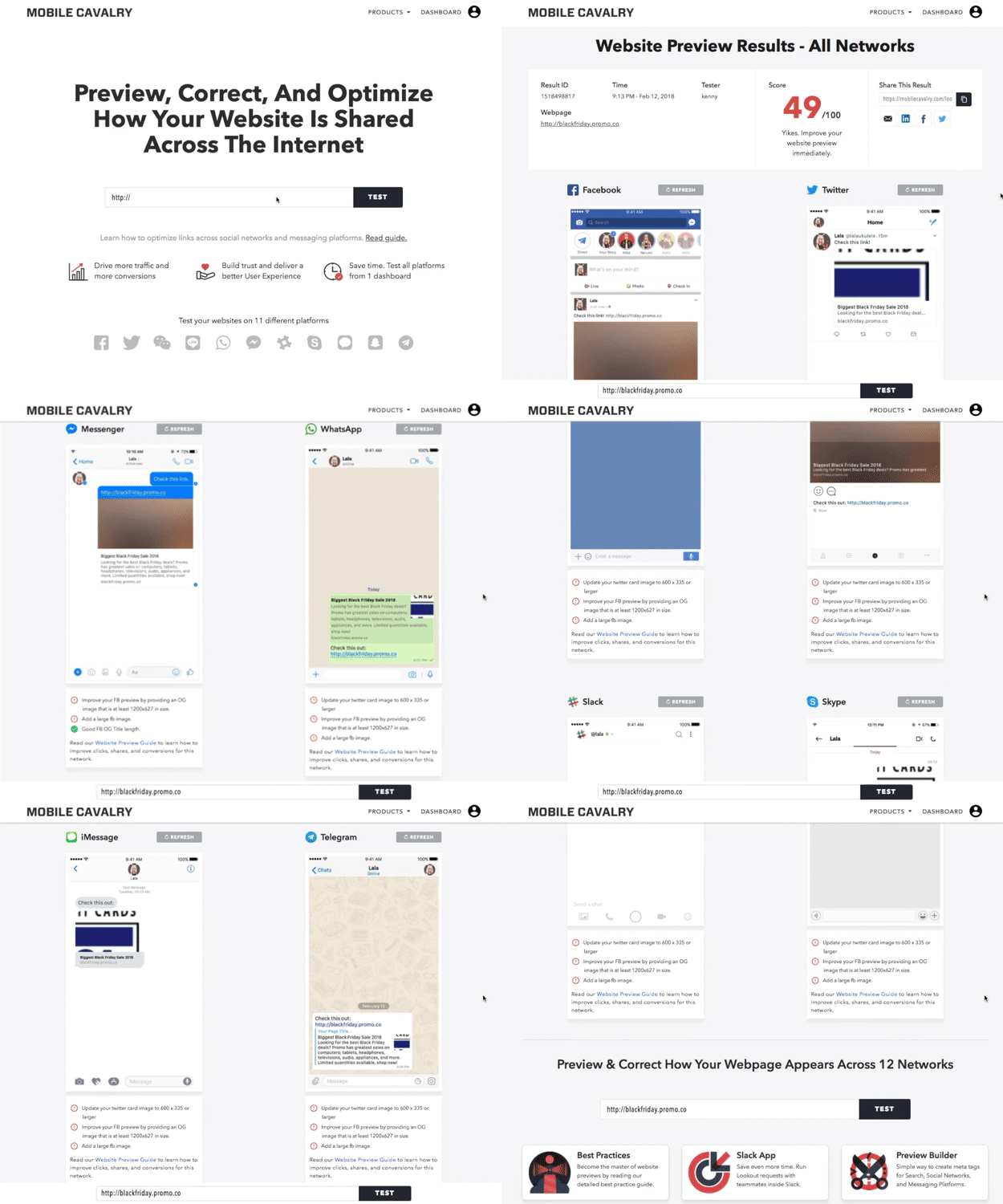
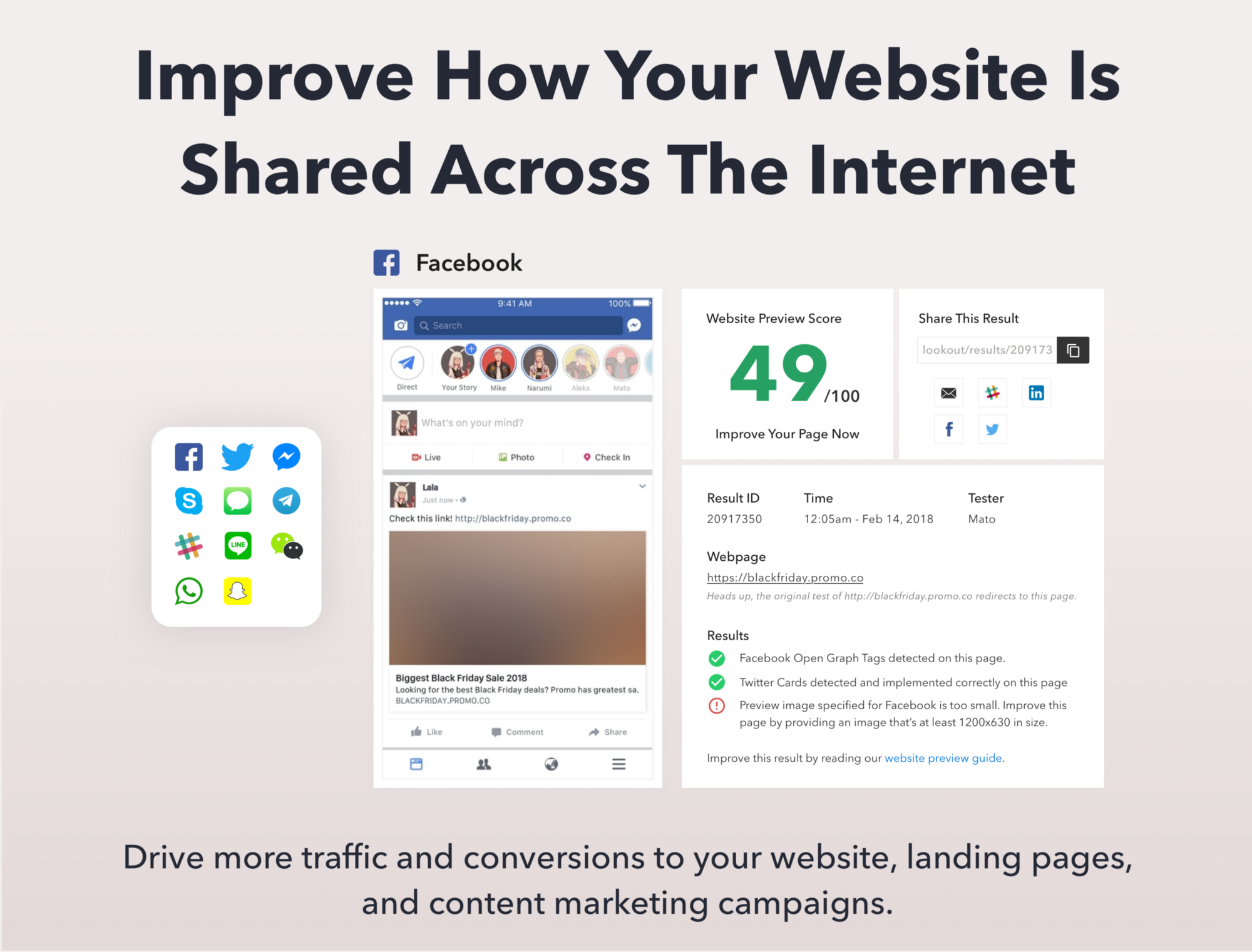
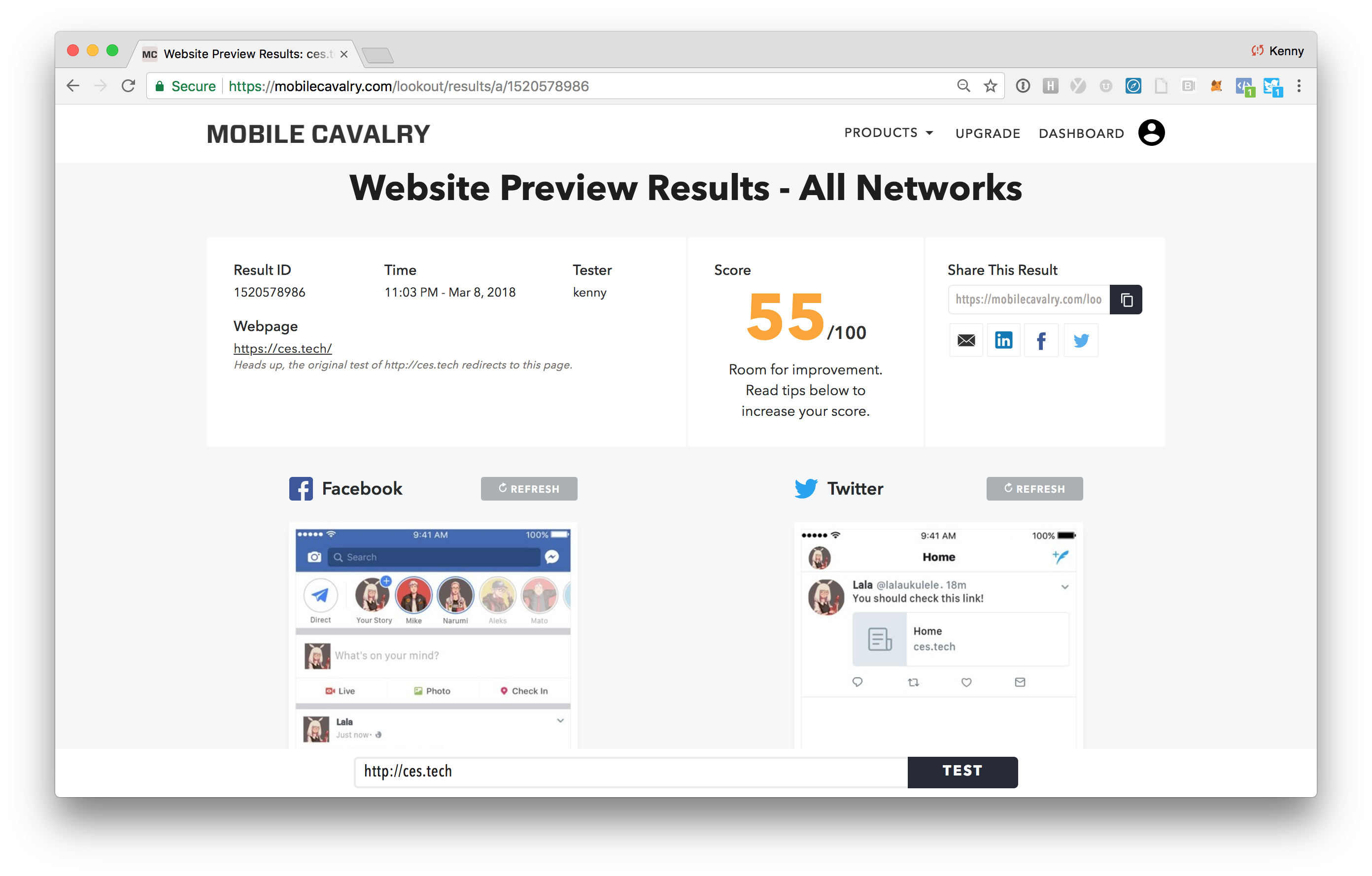
From 1 dashboard, test your webpage across 12 social and messaging platforms. Drive more traffic and conversions to your website, landing pages, and content marketing campaigns. Get report card and actionable tips to improve your website preview. Run a free test on your website, or view a sample report on http://ces.tech.
Website Preview Best Practices
Become the master of Website Previews. Learn the most dos, and must nots. Our first educational resource that’s a must read for any website owner or website team. Read guide now.

Website Preview Builder
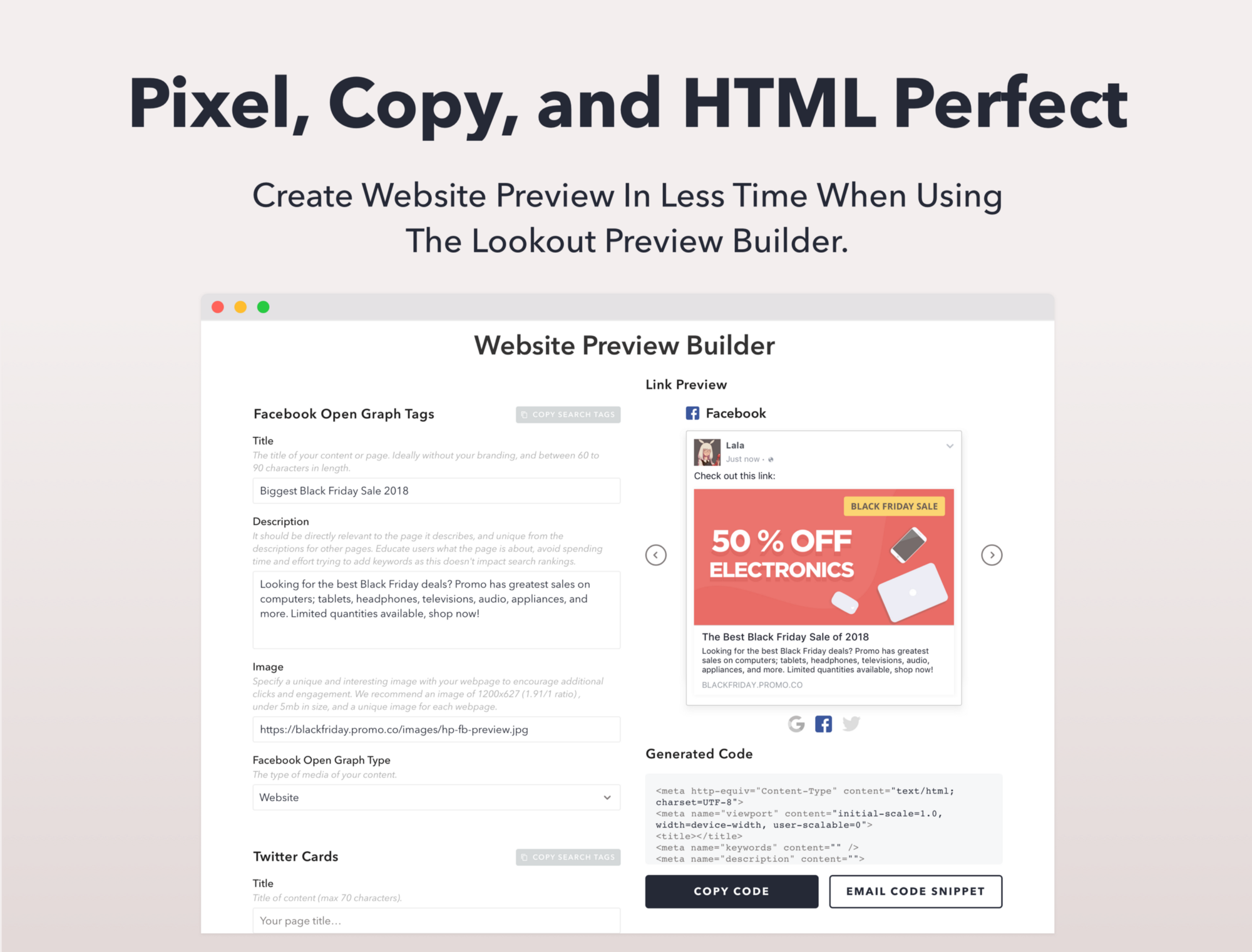
A simple way to create website preview meta tags for Search, Social Networks, and Messaging Platforms. Get the perfect preview in less time and without any HTML errors. Create preview now.
MC Slack Application
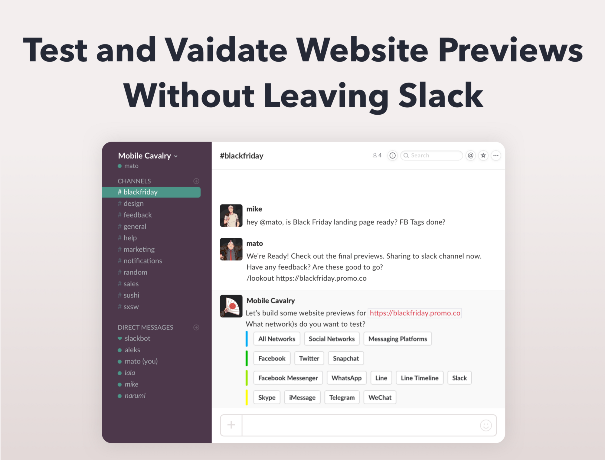
Run Lookout requests with teammates. Get feedback, launch campaigns faster, and improve team workflow. Add to slack now.
We’re pausing our Intel magazine product to focus efforts on building tools for the future of website previews. This seems like a larger opportunity.
8. Our Mission & The Future of Website Previews
Our Mission
Fix and build the future of interactive website previews. A third party that sits between website owners, website teams, publishers, platforms, and consumers. Be the catalyst that builds a new set of standards, tools, and best practices to better serve consumers.
We’d love to develop open source components towards a new website preview standard. We need your help. Please see bottom of post.
What does “interactive website previews” actually mean?
Previews exist to help consumers. Messaging Platforms and Voice powered applications are on the rise. I believe these platforms will kickstart a revolution of website preview change.
Where and How to Build The Future?
Do you focus on the present, or just build for the future? In this case, we’re doing both, but starting with the present. Lookout helps website owners and website teams reach consumers on social and messaging platforms. We’re exploring SDK’s for publishers, and what comes next. The tools announced within this post are focused around education and workflow tools for website owners. Helping website owners drive the most possible traffic from social and messaging platforms.
9. Unanswered Questions
Questions to unlock the future of website previews:
- How can website previews better serve consumers in these new environments? Why are existing platforms serving unsophisticated previews?
- How can website previews show more context to consumers? Fakenews is on the rise. How do we protect consumers?
- Why can’t we interact and complete transactions inside website previews? What platforms, interfaces, and payment methods will we use? Where do these transactions occur? Are websites necessary? Will social networks, messaging platforms, and voice platforms like Alexa and Siri replace eCommerce websites on the internet?
- What’s the best way for consumers to gather and share content? How should platforms improve this experience? How can website owners deliver information and better serve customers on these platforms?
- Can publishers serve consumers and monetize from a new website preview standard? How do business owners (the ones selling products online) and platforms work together to service their customers, the consumer?
We’ve been thinking deeply about these questions. Feedback + open discussion welcome.
10. Call for help
We need your help. Do you have direct feedback, ideas, or know someone that’s working on this problem? Have you “been there, and done that”? Are you personally interested in this problem? Please get in touch. We’re super keen to chat, and open to collaborate. My email address is kennywgrant@gmail.com, or I can be reached via @allbombs on the twitter.
That’s all for now. Visit unfurls.co or join our newly created slack group to give feedback, or say hello. Thanks for reading, bye for now!