When Sheel Mohnot mentioned Lapse was topping the charts, I had to check it out. Lapse turns your phone into a disposable camera — photos stay a mystery until they develop later. Think Dispo meets Snapchat. I went through the full onboarding flow and took some notes.
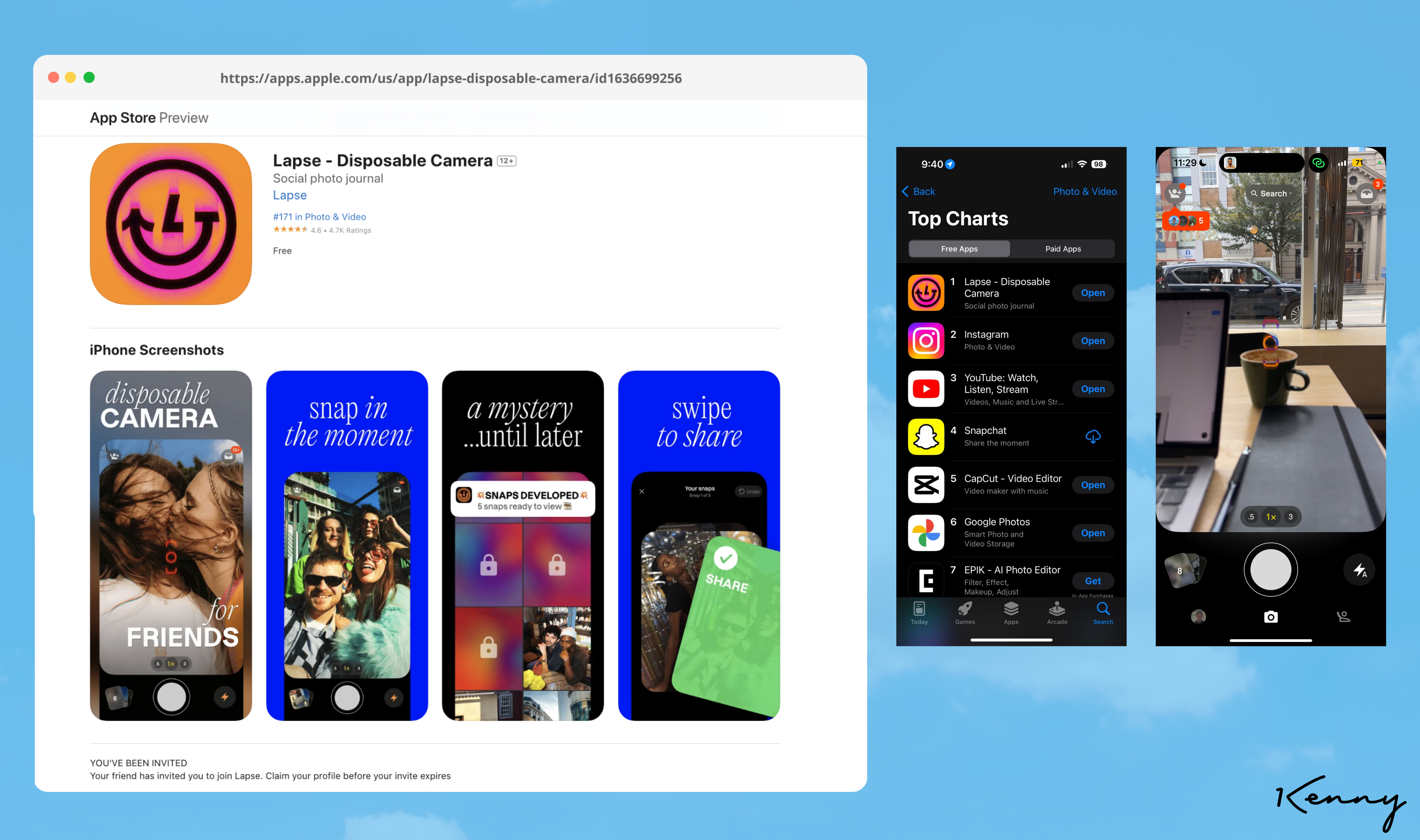
The Lapse team leaning hard into "Invite Only"
Dogfood notes:
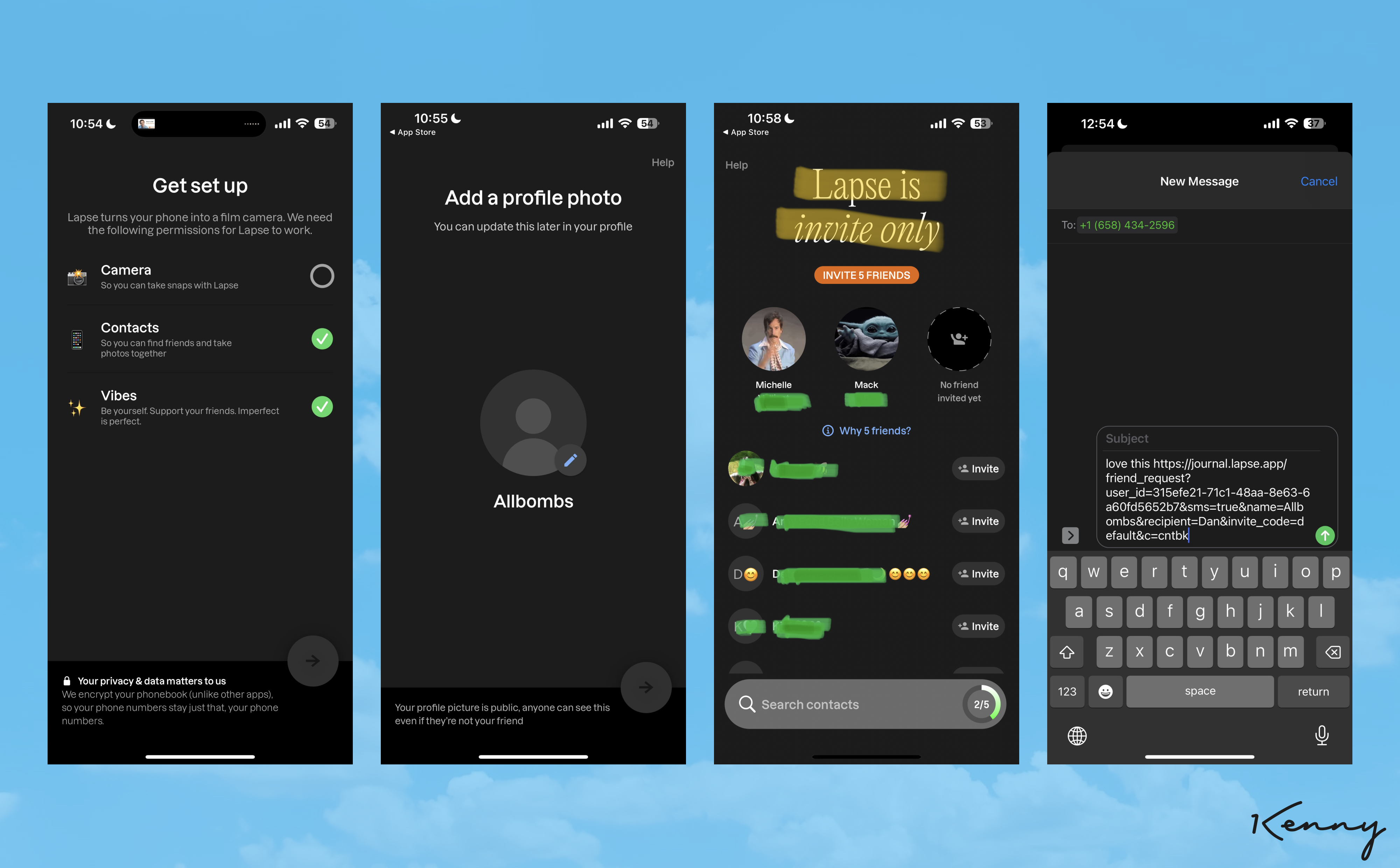
- onboarding process requires new signups to connect address book, capture profile photo, and invite 5 friends
- privacy notice is strategically mentioned at the bottom of the first screen, likely to encourage users to grant permissions more easily and improve activation rates
- when inviting friends, they’d pop you into an sms modal with pre-filled text with pre-populated messages such as “ok this is cute” or “love this” etc
- automated sms prefill tested (hella optimized) for k factor. However, there’s nothing to share that’s cute, that you love, or you’re obsessed. You can’t even use the app yet!
- share url utilizes profile photo for og image invites. Capturing profile pic prioritized for viral “invite only” sharing to friends
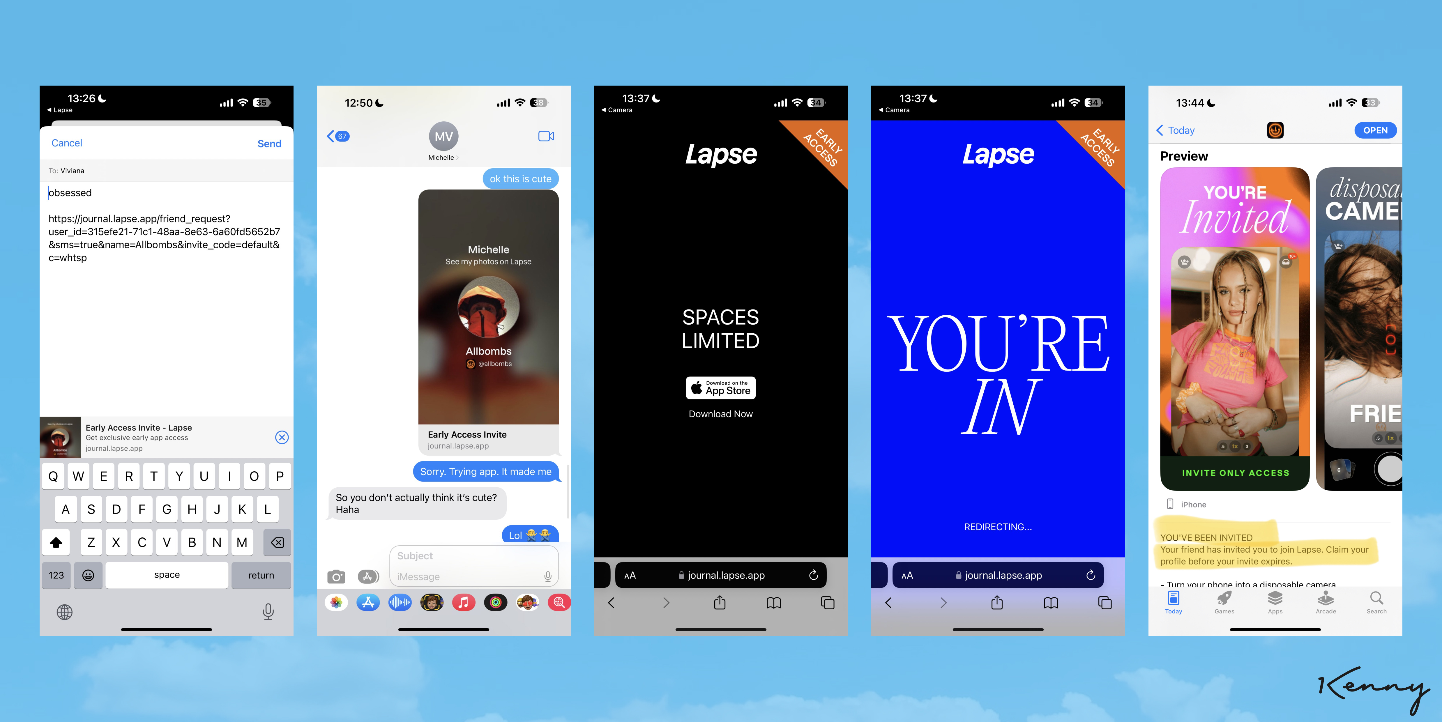
- your unique landing page is qr code with fomo text to join friend
- throughout the entire website & app store “invite only” text is plastered literally everywhere and feels thirsty
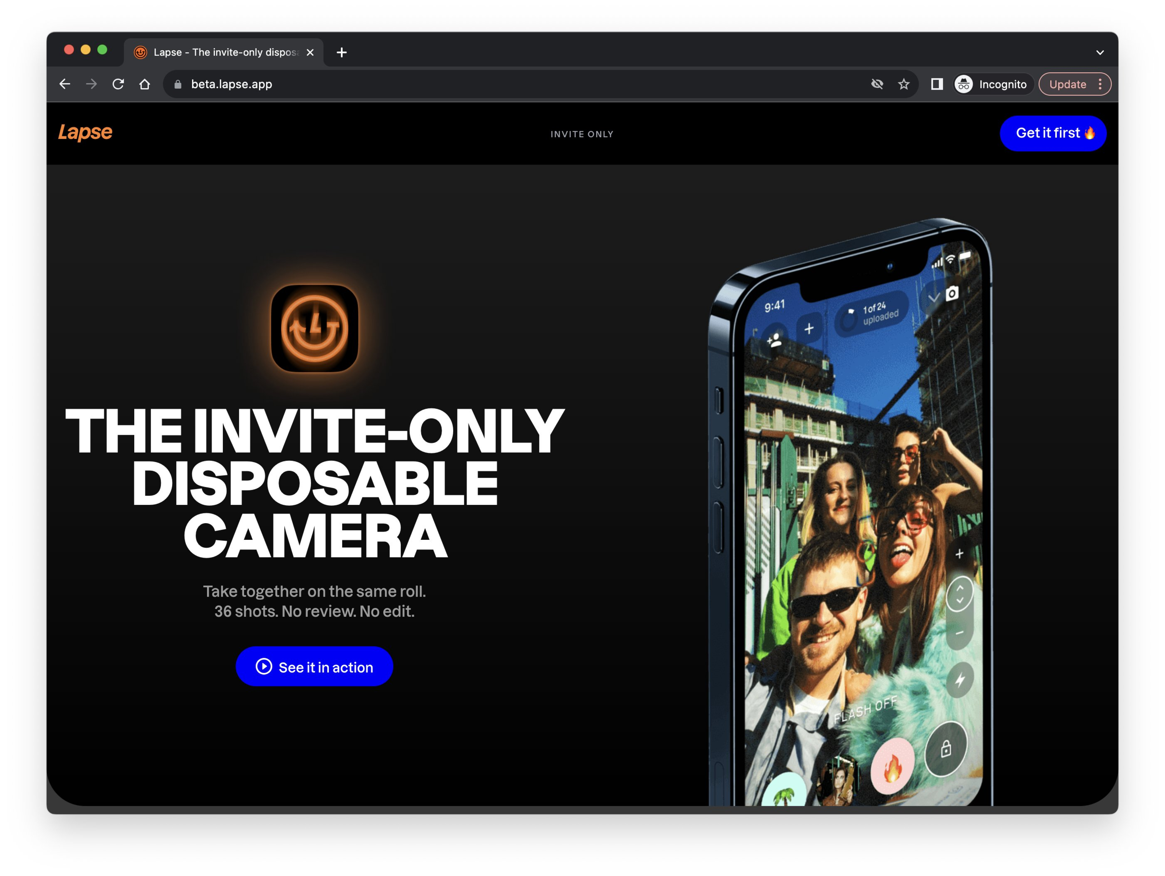
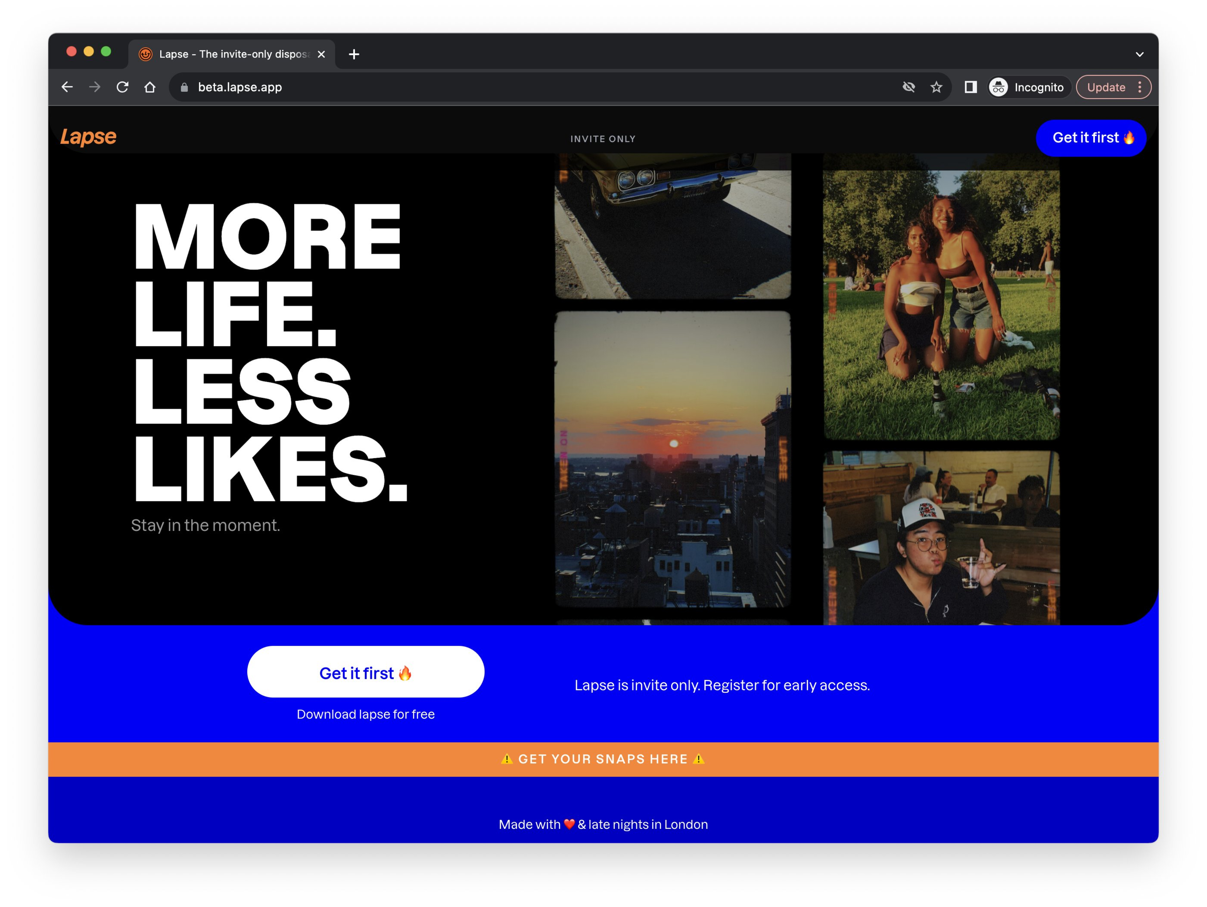
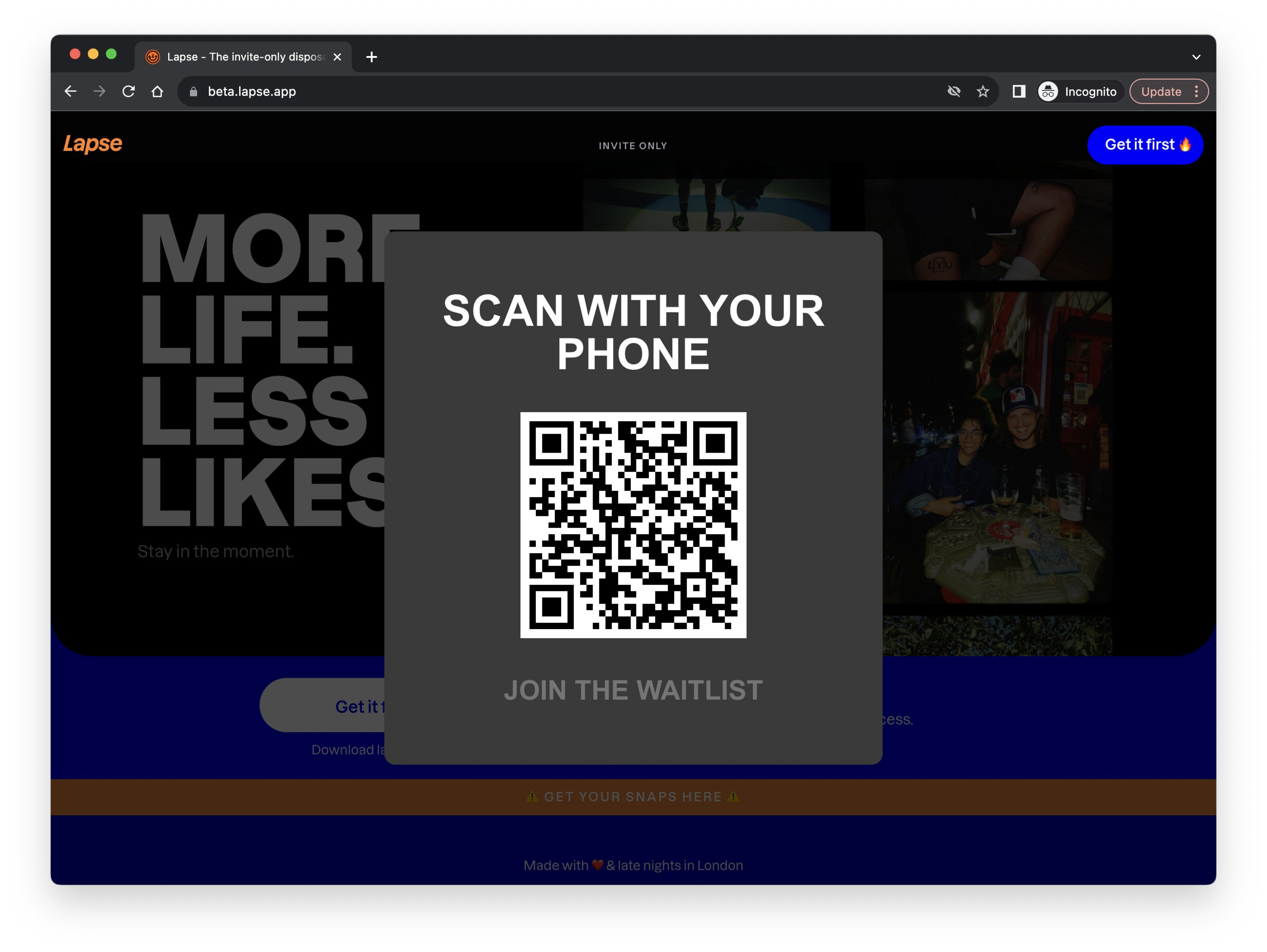
- Website references “limited seats” making the company ethos of “real life, less likes” seem like a farce
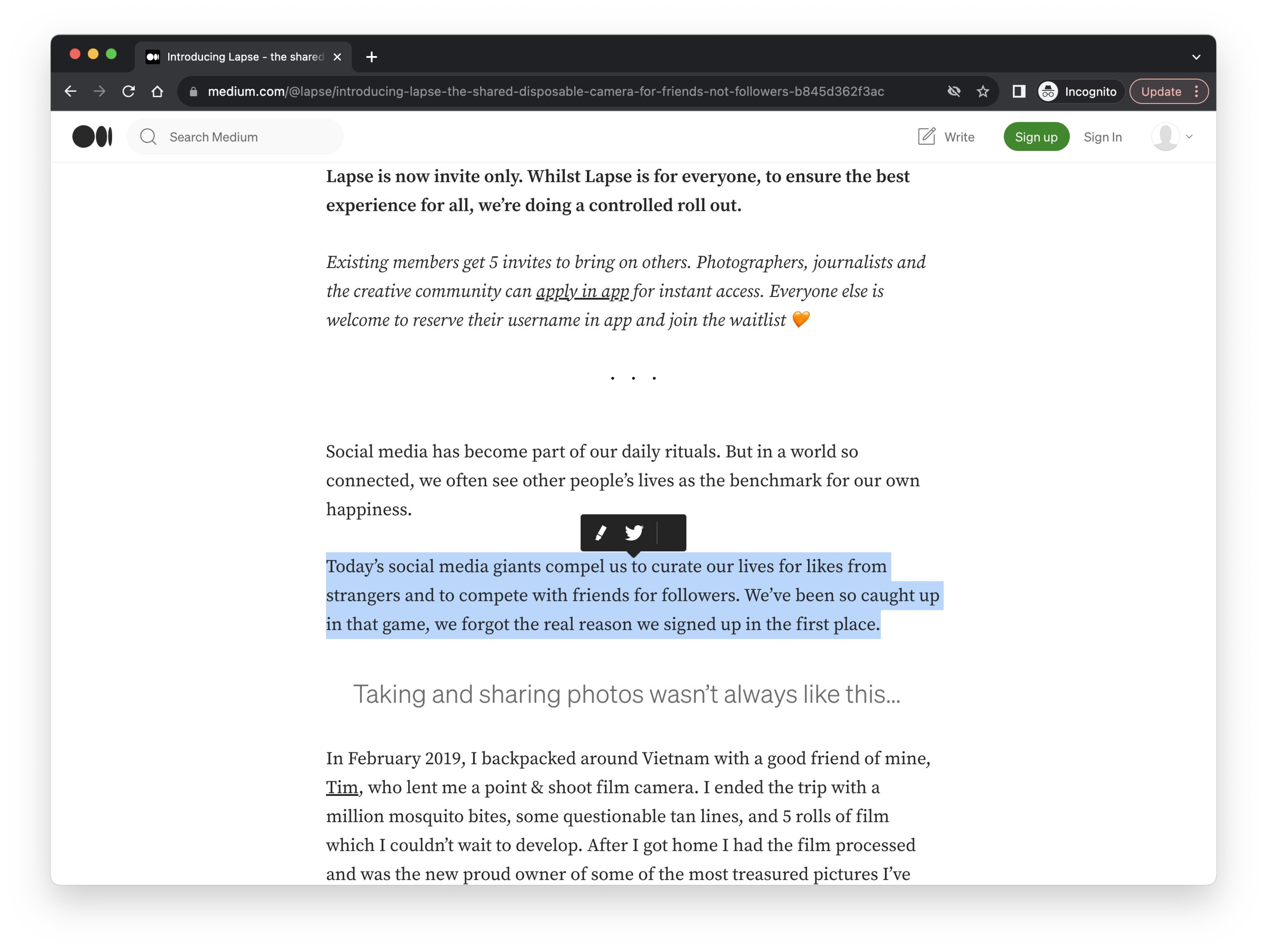
- Lapse wants your friends, and happy to insert a multivariate fake testimonial on your behalf without you even using it, or getting past the registration flow.
Thoughts
The invite-only framing is aggressive. Pre-populating fake enthusiasm on behalf of users who haven't even opened the app is a choice. It might work for growth numbers in the short term, but it runs directly against their own "real life, less likes" positioning. Something to watch.